Showing posts with label Analysis Work (Other). Show all posts

Thursday, 10 March 2016

Tour Poster Research

Before designing my own tour poster I wanted to look at some existing, real-life examples which have been used by famous and successful music artists ago promote their work. Below are the pictures of the a few posters I've seen along with some of my own thoughts and opinions on the designs.

Foals Tour Poster


This is the tour poster for Foals 2016 music tour. The overall design of the poster is relatively basic and is minimalistic in its design. The large round symbol in the centre is half filled with a block yellow top and is then made up by black and yellow lines for the bottom section. The poster features all of the dates for the tour as well as the venue for each of the performances. I like the limited colour palette used for the poster graphics and I think the simple, large title and symbol, followed by the aligned dates and venue information works well for a tour poster. If I was going to take inspiration from this design it would be the aligned format of the text and images. I think the structure of the design and its layout works well.


Clean Bandit Tour Poster
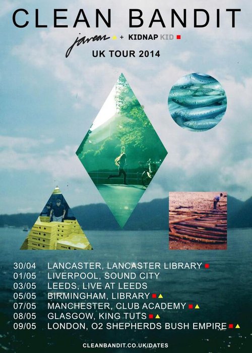
Clean Bandit's 2014 UK Tour poster is the design on the right. The artists poster is made up of one background image of a large expanse of water with mountains and cloudy skies above. The image then has a triangle, square, diamond and cycle overlaid on top of it which each contain more pictures which have been given a colour tint to add more interest and overall render to the design. The large type at the top of the poster shows the name of the artist and the aligned, smaller text at the bottom of the poster provides tour dates and venues. Furthermore, this poster gives a web address which the reader can use to get more information. This is an element that I think would work well in my own design and would therefore be something I may include in my tour poster. The tour poster for Clean Bandit is essentially a larger image of their CD design and therefore this use of cohesion in design is something I may choose to do when it comes to producing my own designs to use for marketing.

The 1975 Tour Poster


This is the poster for The 1975's 2014 tour. Similarly to other posters I've been looking at, this one has the artist's name in large font at the very top of the design. It then has the tour dates aligned and in a much smaller font size from the centre to the bottom of the poster. I think the text is possibly too small, especially if it was going to be printed in A4. However, something I do like and something I think works really well is the black and white monochrome design which gives an element of simplicity and sophistication. I also think the choice to avoid colour is something that might say something about the character of the artist. It may also signify the style of music the band produces and I think the use of black and white is something I might choose to use in my own tour poster and marketing product designs.

Saturday, 17 October 2015

Unorthodox Jukebox (Bruno Mars) - Album Cover Analysis


Unorthodox Jukebox (Bruno Mars) - Album Cover
The Grammy Award winning Album, Unorthodox Jukebox, was released by Pop/R&B sensation Bruno Mars in 2012. Featuring a gorilla playing a jukebox as the main focal point of the design, the CD cover is a relatively basic looking piece. The image on the front has been produced by taking one simple photograph. Having the image in the centre of the album cover, on a plain background suggests it is highly important through the album’s meaning. Many of the songs on the 10 track disc have songs linked to love and the confusion of emotions that come with love itself. The confused looking gorilla connotes the types of feelings someone may go through throughout the course of a relationship. Gorillas are often seen as strong, dominant animals which may reflect on the power some characters have in relationships. On the contrary the slightly reluctant and confused expression shown through the ape’s body language indicates some people may not understand certain things within relationships. Many of the lyrics in Bruno Mars’ songs further show this.

Unorthodox Jukebox’s 3rd track on the album, “Gorilla”, links back to the bold image of the gorilla on the cover. The lyrics (which were written by The Smeezingtons) describe how Bruno Mars feels like a gorilla when he is having sex and how he is high from cocaine (metaphorically). Powerful lines such as “You and me baby making love like gorillas” further conveys his strong passion for sex and adds to the importance of the image on the front of the album. The way in which the design of the cover links the name of the album and one of the songs works really well. It’s effective because it means the track can be easily identified to being part of the album.

To add to the image’s background. It has been said that many of the instrumental pieces in the song ‘Gorilla’ give a 1980’s feel, similar to that of songs by Prince. This nostalgic feel to the song could suggest the reasoning behind the name, Unorthodox Jukebox and also the use of the Jukebox in the album cover design. Jukeboxes played a huge part in the music industry during the 1980’s and it could be argued this iconic piece emphasises the link between his music and the era of the eighties.
Doo-Wops & Hooligans (Bruno Mars) - Album Cover


Having compared this album cover to his first album, ‘Doo-Wops and Hooligans’ I noticed both had very plain backgrounds. I also like how the album covers use little colour but still paint a very strong image. Also, the cover designs on both depict a certain emotion. I feel this is an effective way to generate feelings to the CD before the audience has even listened to the song. It’s also a good design idea because it strengthens the lyrics in the different songs on the albums.

Love is a four letter word (Jason Mraz) - Album Cover Analysis

The fourth studio album by American singer – songwriter Jason Mraz, “Love is a four letter word” was released in April back in 2012. Mraz mainly performs songs from the pop rock genre. His songs often feature connotations of love, hence the name of this album.

  Most cover designs feature the name of the artist and usually the name of the album. “Love is a four letter word” does not feature either of these things on the cover. The cover itself is an incredibly basic design. With a plain background many albums would have a bold or detailed image to create more depth and interest in the cover. However, on this cover there is just the word ‘Love’ represented by 4 basic shapes. The shapes are simply coloured with basic block fills and have a drop shadow to give them a more 3 dimensional effect. Despite this, the cover is still very basic in its complexity. With the basic but relatively bold design, there are several connotations created.

Love is a four letter word (Jason Mraz) - Album Cover
 One connotation of the different shapes and colours could be that love is always different. It may suggest that there are different stages of love and that none of them are identical. The majority of the songs featured on this album also convey the idea of love being varied and no song does this more than the 4th song on the album, ‘I won’t give up’. The song contains the lines ‘I won’t give up on us, even if the skies get rough’ and ‘When I look into your eyes, It’s like watching the night sky’ which both show the beauty love can hold. Songs on this album contain a lot of lyrics displaying love as something pure. This is reflected through the use of the basic album cover. The pure and simple word, ‘love’, further indicates the strength of love and the meaning of many of the tracks listed on the disc.

 I really like the design of this album cover because at first many people may not recognise the shapes form the word love. Secondly, I think this design is really good because it challenges the tradition of having the full album name on the front. This makes it unique and adds to the individuality of Mraz’s music.

 It could be described as an abstract design due to the use of separate shapes. On the contrary, when together and positioned in the way they are they clearly form the word, ‘love’. This would suggest the design is more realistically inspired as it creates a visual piece that has a meaning behind it.

 In comparison to some of Jason Mraz’ other albums, this cover design is relatively similar. Many of his albums feature a plain and simple background with a basic shape or image printed across the centre of the cover. This suggests a continuity in his music style as well as creating implications that is music often has a core, a central theme.

James Blunt - Website Analysis

James Blunt, is a British pop rock/soft rock artist who was born in 1974. The ex-captain in the British Service is now a highly successful musician and singer-songwriter. He has released 4 albums in his music career and has his own website (http://www.jamesblunt.com/home.htm?force=show).

Facebook Profile Link
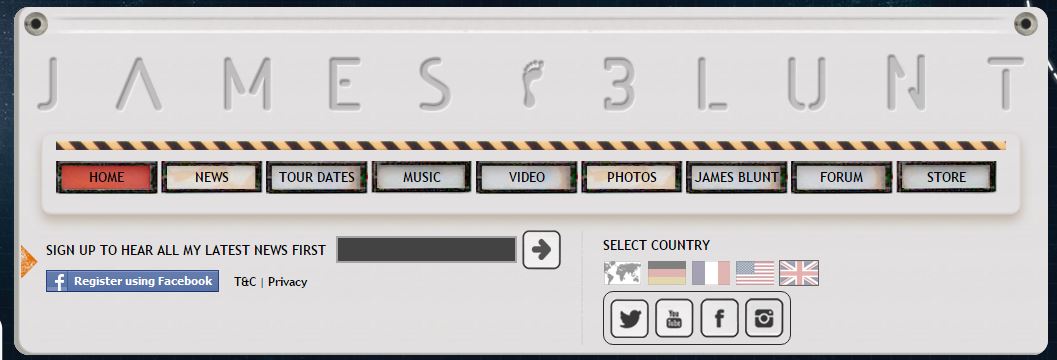
 The site is used by James Blunt to reach as many fans as possible. Within the 3 column layout there are multiple social media links such as an image of his Facebook page and a custom widget of his twitter account, including a live scroll of his most recent tweets. Many people know about Blunt’s twitter antics. He is renowned for his witty comebacks at twitter ‘haters’ and his comedic approach to social media is one reason he has over 1 million followers on twitter and over 6 million likes on his Facebook page. These social media widgets are all displayed in a silver coloured box with small graphics of pop rivets in the corners to give the effect of a music deck or amp. These widget designs reflect his pop-rock genre and create a more personal element to his website.

Menu Tabs
At the top of the homepage there is a full width header which features 9 separate tabs. The tabs can be used to navigate around the website. Each tab/button has been designed to look like a button you may find at the top of a classic amplifier. In fact, the design of the whole home page has been done in a way that makes it look like an amp. Another thing that is good about the tabs is that when you hover over then with the cursor they fall back and glow so that they look like a backlit button being pushed in on a speaker. The idea of an amp is good because it matches the genre of Blunt’s music. It’s also quite interactive and amusing which suits his music which is often humorous and fun.

 Furthermore, the background of the website is also very suited to James Blunt’s music and more specifically his 4th album, ‘Moon Landing’. The Album, released in 2013, featured the single ‘Bonfire heart’ and songs such as ‘Postcards’ and ‘Bones’. The background of the website is a large dark image of a board with images of moon, earth and depictions of early sketches of the solar system as we know it. The background of the website was changed when ‘Moon Landing’ was released. This adds to the synchronisation between the website and the artist’s music itself.

Video Gallery
 One key feature which allows for the commercialisation and advertisement of Blunt's music is the gallery/music video feature. This is a small window which can be used to listen to/watch the latest media products produced by the British artist. This dynamic element of the website allows the
audience to consume the media straight from the website without having to visit an alternative site such as YouTube.


One other key feature of the website is the inclusion of tour dates and ticket prices for the upcoming year. This provides people with an easy opportunity to book tickets and increases sales making bigger profits for James Blunt and his team.