Showing posts with label Marketing. Show all posts

Friday, 11 March 2016

Tour Poster

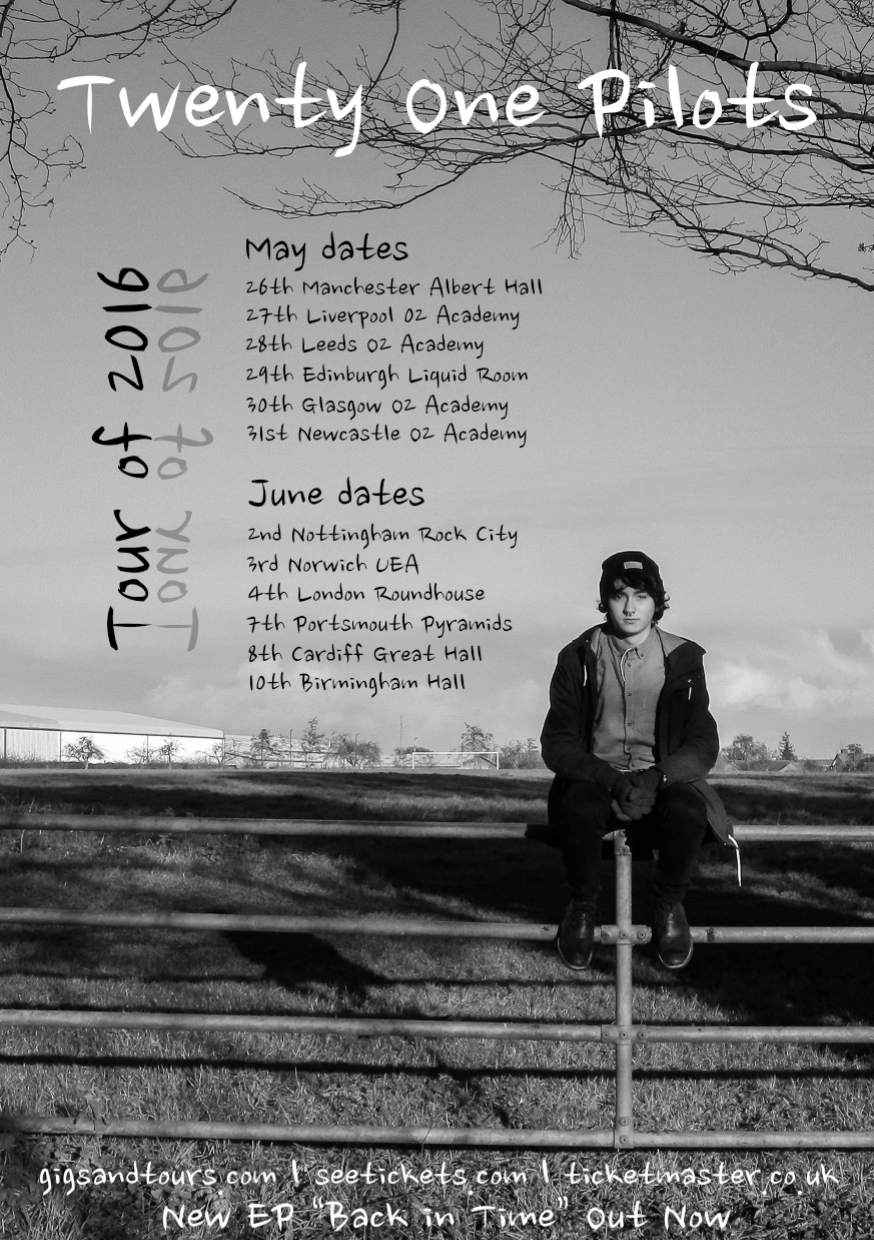
This is my final tour poster design. Having looked at existing poster designs I was able to see what information was needed on the marketing material and therefore I could ensure my design had all the elements it needed to be successful.

To link my tour poster with the album design I've also made I decided to use a similar photograph which shows Jordan sitting on the metal gate in front of the natural background. Having the poster design in black and white helps link it with my other marketing design work and means my products have a direct cohesion between each other. I think the poster works well because the photograph is very similar in style to my CD designs but this image is of Jordan sitting on the gate whereas on the CD case design he is stood up on the gate. I also think the typeface on here works well as it is the same as the one I've used on my other pieces.

My tour poster is successful as it provides the tour dates and locations, the websites for booking tickets and also tells readers that the album "Back in Time" is out now.

Thursday, 10 March 2016

Tour Poster Research

Before designing my own tour poster I wanted to look at some existing, real-life examples which have been used by famous and successful music artists ago promote their work. Below are the pictures of the a few posters I've seen along with some of my own thoughts and opinions on the designs.

Foals Tour Poster


This is the tour poster for Foals 2016 music tour. The overall design of the poster is relatively basic and is minimalistic in its design. The large round symbol in the centre is half filled with a block yellow top and is then made up by black and yellow lines for the bottom section. The poster features all of the dates for the tour as well as the venue for each of the performances. I like the limited colour palette used for the poster graphics and I think the simple, large title and symbol, followed by the aligned dates and venue information works well for a tour poster. If I was going to take inspiration from this design it would be the aligned format of the text and images. I think the structure of the design and its layout works well.


Clean Bandit Tour Poster
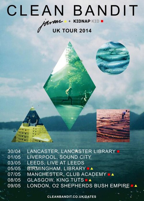
Clean Bandit's 2014 UK Tour poster is the design on the right. The artists poster is made up of one background image of a large expanse of water with mountains and cloudy skies above. The image then has a triangle, square, diamond and cycle overlaid on top of it which each contain more pictures which have been given a colour tint to add more interest and overall render to the design. The large type at the top of the poster shows the name of the artist and the aligned, smaller text at the bottom of the poster provides tour dates and venues. Furthermore, this poster gives a web address which the reader can use to get more information. This is an element that I think would work well in my own design and would therefore be something I may include in my tour poster. The tour poster for Clean Bandit is essentially a larger image of their CD design and therefore this use of cohesion in design is something I may choose to do when it comes to producing my own designs to use for marketing.

The 1975 Tour Poster


This is the poster for The 1975's 2014 tour. Similarly to other posters I've been looking at, this one has the artist's name in large font at the very top of the design. It then has the tour dates aligned and in a much smaller font size from the centre to the bottom of the poster. I think the text is possibly too small, especially if it was going to be printed in A4. However, something I do like and something I think works really well is the black and white monochrome design which gives an element of simplicity and sophistication. I also think the choice to avoid colour is something that might say something about the character of the artist. It may also signify the style of music the band produces and I think the use of black and white is something I might choose to use in my own tour poster and marketing product designs.

Tuesday, 8 March 2016

Final 2 CD cover designs (front&back)

Having made 4 initial front cover CD designs I have now taken my favourite two forwards to develop and produce a back cover for as well. I liked 2 of my designs more than any of the others and therefore decided these two would be the ones I kept to take forward into the development stage.

This is the first of my two final ideas. The idea behind this picture is to combine the element of nature - which is shown throughout my music video - with the idea of fun, happiness and childhood. I think the action of the performer reflects this well and I also think the typeface I've chosen work well with the black and white aesthetic. I have also focused on the framing and structure of the photograph to make it suitable for my CD cover. The use of layers, the dark grass bottom layer and the plan sky, work well as it creates a contrast and also allows me to put the title of the album over the darker section. I set the typeface to a light grey and applied a 70% opacity which gives it a transluscent look.

I also wanted to create a back design which would match the front. The design I have made uses a different picture but using a similar aesthetic. The image was taken using the same lighting and set up but with my hand in the foreground to create the large silhouette in front of the figure in the background. I have added 5 of the original album's songs to create an EP which would have 'Stressed Out', the song I used for my music video, as the first track. The design of the cover matches the colour scheme and mood of the front cover but adds a further element of fun to the overall brand of the design. I also chose to include the track times of each song as an extra piece of information. The layers on the back work well as they did on the front.

This is my favourite design of the final two. It features my friend and star performer, Jordan sat and stood on a fence in different positions while I took 3 different pictures. I then used the picture editing software, Adobe Photoshop, to merge the 3 images together into the final photograph you can see on the left. I also used the software to add the album title at the bottom of the design. When creating the image I considered the framing of the shot by the large tree on the right, the long metal fence and the plain sky above. As well as these elements I looked at the dark grass which would form the background behind the text. I also set the opacity up on this cover design as it added more interest to the design as a whole.

This is the back of the final CD design. I really like my work for this section and think it has worked well with the front design.  The photograph is one of the 3 that I used to create the merged front CD cover design image. I also used the dark grass section to apply the text needed on the album and used the lightly coloured sky as a canvas for the track details on the EP. I think the image of Jordan standing and the writing set out next to him works well because it creates a dynamic and entertaining layout while looking highly professional and being easy to read.  I also think this design works well because the text reflects the structure and direction of the tree's branches as well as the bars across the metal fence in the foreground. All in all I'm very happy with my final EP designs.

Thursday, 3 March 2016

First CD Album Designs

In order to promote and sell my work in the music industry I would need to create a CD and packaging design to house the album. 

I wanted to create something that would tie in with the natural theme of the music video and the style of the already existing twenty-one pilots albums. You can see my research into past album designs in by clicking this link: Twenty One Pilot's Album Covers

These are my 4 CD designs. I have created them using adobe photoshop and adobe illustrator. When taking the pictures I used a tripod to ensure that each picture contained exactly the same background. The only thing to change between each image would be Jordan's location. This then meant I could edit the image and cut Jordan out of one picture and into another to give the effect he was in lots of different places in the same picture. Below you can see my 3 CD designs. 

Lost In Time - My first album cover design.
This is my first album cover design. I created it using photoshop and illustrator and mainly focused on creating a distorted image that still resembled the face of the performer. This blurring effect matches the name of twenty one pilots most recent album "Blurryface" and also matches some lyrics in the song "Stressed Out". The background of the CD design is made up of the words "Lost In Time" in a wingdings font. The effect looks good and has meaning behind it which enhances the album cover in my opinion.
Lost In Time - My second album cover design. 
The idea behind this design was to combine the idea of nature using the tree, and the idea of fun and childhood which is present in the lyrics of the song 'Stressed Out'. I used the image of Jordan hanging from the tree to reflect this element of childhood and fun because it is something that is childlike, playful and careless, all things that the lyrics suggest the performer misses.

Back in Time - My third album cover design.
This is my 3rd CD album design. It features the star of my music video, Jordan, in front of the setting sun. I wanted to use the natural landscape to match the theme of my video and also used the sun as a representation of time and how things can run out. I like the design of the CD cover because it works in layers and the type is clear and easy to read. The black and white also works well and may be something I use in my final design. 

Back in Time - My fourth album cover design.
This is the last of my album designs. Similar to my second design, this cover mainly focuses on the element of time and change. I have used the fence as a symbolic reference to being trapped and cut off. I have also chosen to have the image in black and white which also suggests time and the past. The 3 positions Jordan is in are also key to the design of this cover. From left to right he gets lower down, this symbolises how time can lessen a person or how time can reduce the levels of happiness. The change in height also represents the downwards curve in a graph showing a negative change over time.


Tuesday, 1 March 2016

Twenty One Pilot's Album Covers

'Twenty One Pilots' - Twenty One Pilots (2009)
Before designing my own album cover I want to look at already existing designs used by the band. I will see what colours, styles and images they use in their marketing pieces and should give me a better idea of what aesthetic to use in my own work. I will be looking at their 4 album cover designs to see if they have any differences or similarities between each other.

This is the debut album from the band Twenty One Pilots. The illustrated cover design shows coloured liquid pouring out from a large chest or box. It's an abstract design as it is difficult to tell what the image is exactly. I don't like the design of this cover because I feel as though if I didn't know the artists, I wouldn't know what sort of music to expect. Although, I do like about it is the different sections and how some parts are in black and white and some are in vivid colour.

'Regional At Best' - Twenty One Pilots (2011)
This album cover is very different from the last. It is made from a single photograph whereas the 2009 album 'Twenty One Pilots' was created as an abstract illustration. This design also features the name of the band on the white banner across the top of the image. It also says the album title on the cover whereas on the indie pop artist's debut album there was no title or text at all, just the drawing. In addition to this, this design features the artist's logo behind the text which adds to the marketing visuals of the group. I like the colour scheme used as they have matched the red and blue in the logo to the red and blue of the children' jerseys. Colour is something that features in many album designs and will be something I think about hugely.

'Vessel' - Twenty One Pilots (2013)
This is the cover design for the 2013 album 'Vessel' by Twenty One Pilots. It is a relatively plain design, simply made from a portrait photograph of two men stood together, arms behind their backs leaning towards each other slightly and facing the camera. There is also a darkened section with a reduced opacity that adds an extra colour element to the design of the album cover. The only writing on the design is the name of the album itself. This contrasts with the band's second album which has their name written across the top of the picture a lot. Similarly to the band's 2011 cover design, it's a photograph of two people dressed in similar clothes to one and other. It also features two people with not much of an age gap between them.

'Blurryface' - Twenty One Pilots (2015)
This is the cover design of the band's most recent album 'Blurryface'. With a back background and 9 pattern-filled circles in the centre the design is relatively minimalistic. The name of the band and the name of the album are both on this cover design which works well however the cover doesn't use any photograph which is a contrast from the previous two albums. I like the limited colour palette used in this design with red, white and black being the only colours used. I think it also works well having the album name and the band name separated by the central artwork. This layout may be something I try to implement in my own design later on in my project.